
Eclectic & BOLD Bedroom revamp - One Room Challenge - Week 2
Hey Hey,
I can’t believe i’m welcoming you to week 2 of the room transformation series The One Room Challenge already. Anyway, welcome again, i’ve gotta fill you in how i’m gone from decluttered to an actual plan of how my bedroom is going to be revamped.
First off, I had to tell Mr that we’re doing the bedroom before he read it on Instagram. I was a little late by a day or so, and release of the first blog (oops). He wasn’t too bothered, I could tell by his comment that he wanted those “ugly ass purple curtains” GONE! So do I, they suck. In fact, they pretty much sucked when I purchased them, floral purple blackout curtains with an added ‘benefit’ of making the room look like a retirement home. Some other folk can get them when I drop those suckers off at the charity shop alongside unwanted clothes, shoes I forgot how ugly they are and furniture that should have a best before date.
At the same time as decluttering I’ve also been getting inspired, on top of working on a few projects for private clients. With those taking priority this week has bee hectic to say the least.
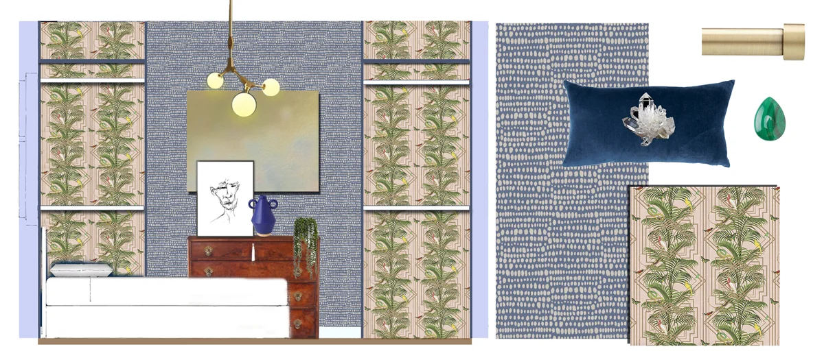
Let’s talk about my inspiration behind the design. Instead a trawling through the Pinterest rabbit hole or scrolling my thumb sore on Instagram I started with my love of music as well considering how I want my bedroom to make me feel. Balancing that with wellness goals arrived me at the word BOLD! This word sums up needing to be in a space that encourages my badass-ness. For some people, the serenity of white and a neutrality of minimalist decor is right for optimal sleep and even better for their social media images. It’s a no thank you for me. I’m colour comfortable and lover of the quirky, when I wear it my mood is upbeat. The same goes for in-your-face patterns, love it. A BOLD design will work for me. Mr, well he’s just going to have to deal with it! Ha! Only joking, he’s not a minimalist, monochrome type of guy either. He DETESTS grey, loves red and is drawn to unexpected combinations. In the Jeck’s corner, I DETEST red, head over heels adore colour and go crazy for strong individual aesthetics. Clients who either are at that level of design confidence or need help getting there are who I enjoy working with.
The word BOLD will be materialising itself into impactful colours, distinctive prints that add to the layers moody lighting and textures worth ruffling the bedsheets for. Liking the direction i’m going in? When designing the most personal of space, that’s your bedroom if you was wondering, don’t forget to consider how you want the space to make you feel, whether that’s sexy, rejuvenated or safe. While you’re doing that ignore the trends and do YOU.
Understanding the room and its potential
It’s the prep work that is the rather invisible part of the design process, yet it’s really essential for getting any project off to a good start. Now i’m gotten over the fact that my bedroom has been a nightmare, and have accepted there’s a ton of work to do, the first thing I had to do was measure up and survey my soon-to-be haven. My bedroom is pretty square (besides two recesses), 3.50 metres by 3.70 metres, with a sash window painted in duck-egg blue. The view outside is to die for, NOT. Outside is a brick and wooden fence, overlooking more bricks. Inside, the architectural features include pipework for the water supply to the bathroom, nondescript skirting boards and a standard radiator.
The ceiling as I spoke about in week one is a half and half combo of wood chip wallpaper and cracks from water damage. All that been said, it has the potential to be great cosmetically speaking. LAWD! I have to moan that there is nothing more hellish than wood-goddamn-chip wallpaper. Urghful stuff. A stubborn so-and-so. With half the ceiling covered in a layer of it I can hardly ignore it. Doing half the job on any design project is half-hearted and only ends up wasting money, your time and energy in the long run.
Take note right here. Do things right once or be prepared to do it twice. Removing wallpaper means you have to move your belongings out of the way. Taking off woodchip means you also get sprayed my specks of wood. It gets in your hair, under your nails, slipping down your cleavage, butt crack even, and sticking to everything like a party crasher. Between this post and the next, i’ll be covered in wood chips and soggy paper. YEY me.
Creating Space for Your Wellbeing
When I was little, as in living with my parent’s age, I had bad allergies. They were so bad that my eyes would be puffed up for the entire Summer. There was a time my teacher pulled me aside in class to ask if my parent’s had been punching me. Not the case at all. She had the cheek to tell me to look her straight in the eye, which I tried to do with my gunk-ridden swollen balls. It was simply explained as Summer’s fault. The effects of hay fever and running about in tall grass pretending I was Laura Ingels. So from early in the life I knew how much your world is hindered when allergies get you down.
“Ditch the chemicals and live in a healthier home”
With a long trail of chemical ugliness being brought into your home via shoes, clothing, food and everything else you welcome over the threshold, indoor air quality is poorer than it should be. Not what you need when recovering from an illness or have organs on the fragile side. You must’ve heard about the young and the elderly being more vulnerable, right? Well, adults are vulnerable too, age is not the only factor. Indoors, the whiff of chemical-ridden room fragrances or spray deodorant play havoc with my throat. I struggle to breathe therefore it clearly works in my favour to build health into my home, surrounding myself with elements that help me breathe easily.
So here’s where I’m going with the paint. Unlike food which you consume, and ship right out of the house within days or months, paint is longer term. It’s best applied with as low a VOC (Volatile organic compounds are organic chemicals that have a high vapour pressure at ordinary room temperature) as possible. Since that ceiling is in dire need of a lick of paint once prepared, I’ll be painting the ceiling.
I’m a keen researcher, you know the type, that person who stands in the food aisles reading labels. *Raises hand* that’s me. I’m forever curious to know what things are made up of and that includes the things we decorate with, furniture and all. So i’ve read up on being about that natural paint life.
“If you have a decorator, stress this point to them so they don’t swap your eco-paint out just because they find another brand easier to handle.”
So rather than hopping on over to your local DIY store and picking any random colour without giving the ingredients a second thought, opt for paint that’s beneficial to the better health of you and your home. I like the best of health for my clients, family and friends too. An eco-friendly, people-friendly, paint is high on my priority light for every project. Of course, it’s a must for this makeover.
A word of warning to those who don’t want to purchase animal-derived products! Some natural interior paints contain casein, which derives from cows and goats. Not all paint options are vegan or cruelty-free. Earthborn Paints has been on my radar for a while and from the look at their samples. There are a few other brands to prick an ear over too. I’ve gone for Earthborn furniture paint as well as the ceiling emulsion. I’ll let you know how I get on.
Earthborn
Auro
Nutshell Paints
“Where you can use natural light because your body doesn’t need to be subjected to its artificial cousin all day.”
Lighting
As you mentioned last week, we’re diving deeper into lighting. Currently, the situation is dire, one dusty little ceiling pendant just about lights the room enough to navigate to the bed and back. It leaves the rest of the space unlit. There are no wall lamps to help the cause and there for sure aren’t any provisions for lighting in the clothes hanging spaces.
Lights, statement, action
With this revamp, I’m taking care of the lighting issue by installing a statement ceiling light that does its job while also looking good. Although I’m not the tallest, and as much as I want a statement piece to reaffirm the BOLD look I’m after, the ceiling isn’t the tallest either. Bare that in mind when creating your own space, consider everyone’s height and the ceiling. Have I found the one that fits the criteria yet? Err, no. BUT come back next week and I’ll fill you in on what light I end up getting.
Bedside lights
The next level of lighting is the bedside lights. So(story coming your way)…..on the way home from work, I may have fallen into the store and nabbed me to marble, brass and blue reading lamps. *NODS* You know when you see something that really catches your eye? Yep, that happened so I called Mr ASAP to get his opinion. It was more of a piece offering really since I forgot to tell him our (ok, my) plans for the bedroom. He loved them so that was the first purchase.
Getting changed in the dark helps no-one
What I have planned for but haven’t gotten yet is lighting for the two recess areas of the room where I’ll be hanging clothes. I really can’t be dealing with picking out an outfit in poor lighting anymore. It’s the worst, isn’t it?! Colour clashing is cool and all that, but you need to see what you’re doing under decent conditions so you don’t leave the house looking wrong. You know like selecting a black top to go with your black trousers and only realising once you’ve left the house that the trousers look ashy against your jet-black top. Or worse, the light is so poor you don’t see how fluffy your trousers really are. URGH!
Creating your colour palette
Blue and Other Colour Stories
During consultations, I never ask what your favourite colour is. It’s a sloppy question that only leads me to a one-word answer and nothing more. Asking a story about colour gets you a far better insight. And mine goes a little like this:
Blue is likeable by the masses. My relationship with the colour is a healthy one and I have fond memories of when I’ve worn or have been surrounded by blue. Red, the polar opposite on the colour chart, however, is my colour equivalent of Nelly Olson. She’d hang around with her hot-headed behaviour but we’ve never got along. At its brightest, I’m irritated. But as I already mentioned, Mr likes red and looks great wearing it. I have given it a chance time and time again but it never goes too well. I wore a red dress to a birthday party when I was 16. Awful! We parted ways that day.
So here’s the compromise, mix red with white, and we arrive at pink. Pink is Red’s cousin you never gave a chance because I knew whose colour family they belonged to. When we hung out though, which couldn’t be helped because pink has been splashed on so interior design mags for a while now. Plus it’s been really prominent at design shows like Decorex. Since I haven’t been able to keep away from pink I started to re-look at what it brings to the table.
“If you’d like to be colour confident but don’t know where to start, reach out to figure out a BOLDER colour palette”
Actually pink is one of the colours in the fabric for my headboard, pretty obvious to bring the pink out of the fabric and use it around the room. Not too much, Red is still the cousin after all.
Gold will be one of the accent colours in the form of brass. It is having a bit of a spotlight still. That’s not the reason I like it though. Brass is my go-to bling-worthy accent colour to give an environment that extra boost of luxury. Don’t be surprised that it’s featured in my bedroom to do just that. Along with a small dose of black and white which I think every room needs a bit of, gold is the one.
Green is epic. I’m a fan of many variations of the colour as it’s one of the most welcoming no matter the environment, especially in the form of plants. As for the crystal malachite, it draws me in and one of my favourite necklaces is made of the stuff. Does Mr thinks green is hot? You’re damn right he does.
And there you have it, colour comfortable palette that’s BOLD yet won’t keep us awake at night.
Details Matter
Maximalist tenancies have me considering the finer details that will elevate my whole experience. Call it woo-woo if you like but crystals are my thing, they are in most rooms of the house so you best believe they’ll be in the bedroom too. Mr sells crystals and woo-woo ware, so will always have a hi5 ready for me when I accidentally buy another to add to our collection. I’m thinking so displaying some on the new shelves as well as integrating crystals of the malachite, quartz and pink quartz selection into art, or drawer pulls. I guess you’ll have to stay until week 6 to see how that pans out.
As for tassels, I cannot help myself as I’m a sucker for them. I have the materials to have my own custom tassels heading over from the Netherlands. I’ve ordered organic cotton to keep up the healthy vibe on even small details.
Putting a visual to that thought
Tribal Wallpaper is ethnic-inspired and a step away from the uniformity of polka dots. It’s a happy medium I can readily deal with. I’ve had a sample of this wallpaper for months, the blue matches well with the headboard fabric so it’s totally in the (shopping) bag! It’s a great textured background for accessories, and great for hiding the less-than-flat walls I have.
Take a few palm trees a snake or 2 and Congo wallpaper it is. Here’s the thing I wanted something nature inspired, I love butterflies are they are the ultimate living creature AND Mr thinks the same about snakes. Perfect right?!
The TRIBAL wallpaper is pretty neat on it’s own, as is the CONGO tropical affair. Used in close proximity to each totally works so there you have it. We’re doing bold!
The brand Mind the Gap is ace, a favourite as their wallpapers are serious contenders for a bold print. As much as I’m a fan though my pocket isn’t so keen. My overall investment doesn’t allow for this kind of splurge. But it didn’t stop me from looking in terms of finding the look I’m after. I found it.
So along comes more investment friendly alternatives which still fit with my vision and light my design fire at the same time. Inside the hanging space is where I’d like more colour, we’re going pink and tropical. The paper has been paid for, I can’t wait for it to be delivered next week. Since the wallcovering will generally be hidden behind the mountains of clothes, spending a ton of money here wouldn’t be wise. I’m totally ok with a wise purchase as a compromise.

Should I go for it with a pink ceiling? I still haven’t made up my mind but Mr know’s it’s part of the plan.
That’s it for this week, thanks for catching up on the bedroom developments, pop back next week to see if I’ve pulled my hair out yet. While the next 7 days passes, do yourself a favour and check out other awesome and seriously talented participants, they too are sharing their Week 2 One Room Challenge developments, frustrations and all. www.oneroomchallenge.com/orc-blog
What needs to happen by week 3?
Get all the prep work done to the ceiling.
Start installing the foundations of
Fills holes and prep for wallpaper on the walls
Order all supplies and furniture (cross your fingers to arrive in good condition and on time).
If you like how this challenge is taking shape, give this post a like, or comment below. Hi5s and curtsies! Til next week 🙋🏾♀️